Connected LOTO Rebuilt

A two-phase redesign that turned a basic rebrand into a production-ready safety platform.

Gray arrow pointing downward with a small horizontal line below the arrowhead.
Login screen with Master Lock cLOTO logo, username and password fields, sign-in button, and forgot password link.Master Lock cLOTO Manager login screen with username and password fields, sign in and scan badge options.

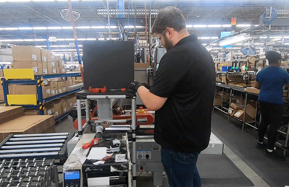
A safety-critical product that needed more than a fresh coat of paint

When Master Lock entered a strategic partnership with Value Hybrid — the startup behind cLOTO, a connected lockout/tagout platform — the agreement was straightforward: Master Lock would take over design, product, and QA, while Value Hybrid continued providing development resources. The business goal was equally clear: launch within five months, starting with a basic rebrand. What wasn't clear yet was the true state of the product — and what it would actually take to make it field-ready.

A rebrand brief that was hiding a much bigger problem...

The product consisted of four separate websites and two mobile apps — each siloed, hard-coded, and built without a design system, error management, or recovery flows. Upon first review, it was immediately clear that the work required went far beyond a visual refresh. Accessibility issues were pervasive: low color contrast, small unreadable fonts, and UI patterns that simply wouldn't hold up in real industrial environments — where lighting is poor, dust is present, and workers are wearing PPE. Navigating across four disconnected websites to complete a single workflow added unnecessary friction to an already complex safety process.
Pain Point:

Having to switch between 4 websites to complete a single task causes delay and frustration

Two login screens for Master Lock titled PROCEDURES and IDP with username and password fields and log in buttons.Two login screens for Master Lock Machines and Tasks with username and password fields and Log in buttons.Side-by-side Master Lock app login screens for Manager and Worker with username or ID and password fields.

...confirmed by the users themselves

These weren't assumptions — they were validated during alpha user research, which surfaced the same pain points consistently. To name a few examples:

  • Unnecessary app interactions that increase time on task and cause frustration;
  • Procedure creation still requires a lot of manual work;
  • Incorrect or missing isloation point types, which stalls procedure creation;
  • No ability to upload an existing procedure, manual input is required
  • Analytics web app doesn't display information that the users actually need.

It was also clear that without a proper design system and scalable UX patterns, the product would never survive expansion into thousands of industrial facilities across the country. The design team had a decision to make: execute the brief as handed down, or advocate for doing it right.

Man wearing gloves assembling or inspecting black product in a factory with conveyor belts and shelves.

Because when the stakes are this high, design quality is a safety imperative

Lockout/tagout procedures exist for one reason: to protect workers from life-threatening hazards. A confusing interface isn't just a usability problem — it's a safety risk. This was something our alpha users understood deeply, and they weren't shy about expressing it:
cloto alpha user:

We want to make sure they (workers) understand that we want them to go back to their homes, and that they perform their tasks safely. That’s our main goal...”

cloto alpha user:

No point of the fundamental idea of LOTO is faster, it’s already intentionally a step to slow you down to do the right thing… to be safe.

Advocating for a phased strategy — and getting alignment

Rather than absorbing the scope of work into a single rushed sprint, the design and product teams collaborated to establish a two-phase plan. Phase 1 would focus on stabilization — fixing the most critical accessibility and structural issues within the original five-month window. Phase 2 would create the space needed for profound discovery work, a proper design system, and a full redesign of core platform areas. Getting cross-functional alignment on this plan was itself a design achievement: it required clearly articulating the long-term risk of shipping a fragile product, and making the case that investing in foundations would accelerate — not delay — the product's growth.

Fixing what mattered most, as fast as possible

Phase 1 was about creating a safe, functional foundation. I conducted a thorough UX audit that identified and resolved 20+ accessibility issues — addressing color contrast, typography legibility, and interaction patterns to meet the demands of real industrial environments. I also delivered the design specifications for merging four separate websites into a single unified platform, eliminating the cross-site navigation that had been fragmenting the user experience. Throughout this phase, I co-led alpha user research and supported QA on bug fixes — ensuring that what shipped was stable, accessible, and ready for the next stage of growth.
Dashboard UI with workflow links for analytics, procedures, equipment, locks, users, and logout.

Building the foundations that would let the product scale

With stabilization behind us, Phase 2 created the space to do the deeper work.

I co-led a comprehensive discovery effort..

Conducting beta user interviews and synthesizing research findings shaped the redesign priorities across the platform.
snapshot of usability testing synthesis
a snapshot from user research sysnthesis

...establishing a design system built to grow with the product...

I led the design system work end-to-end: defining the language guidelines, creating and maintaining component documentation, and establishing cross-platform UX patterns for shared behaviors like search and filtering. I also single-handedly translated the static design system into an interactive prototype in ProtoPie — enabling realistic validation without extensive engineering involvement.
Dark purple arrow pointing downwards.

...and delivered the flows that brought it all together

On the product side, I delivered research-backed, handoff-ready specifications for User Management and Isolation Point Management, and contributed to the introduction of Lock Management — a feature that hadn't existed in the product at all.
Dark purple arrow pointing downwards.

From contributor to de facto lead

I joined this project as one of three designers alongside a senior manager. Over the course of the engagement, one peer was reassigned to another initiative and another left the company — leaving me to carry the design workload while the team rebuilt around me. As new mid-level designers were brought on, I onboarded them using documentation I had authored, effectively stepping into a lead role without a formal title change. This meant not only delivering my own work, but setting standards, maintaining design quality, and ensuring continuity across a product that was evolving rapidly.

A fragile prototype transformed into a scalable, field-ready platform

The impact of the two-phase approach was measurable and meaningful. Resolving 20+ accessibility issues brought the platform up to the standards required for real industrial environments. The unification of four websites into a single platform was validated in Phase 2 user research, which showed a 30% reduction in time on task. Redesigned flows across User Management and Isolation Point Management met user needs 1:1 in usability testing, with a further 25% reduction in task completion time. Perhaps most importantly, the platform now has the design system, documentation, and scalable UX patterns needed to grow — across features, teams, and facilities.

The details behind two of the most complex workstreams

I've selected two areas of this project that warranted their own dedicated case studies — each representing a distinct design challenge with its own research, decisions, and outcomes.