
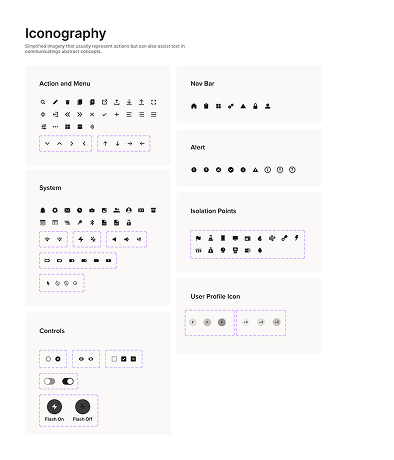


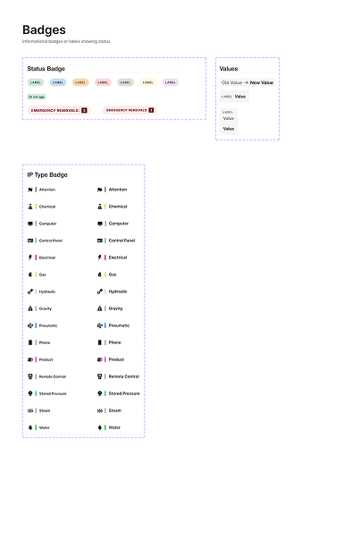
overview
A product with no shared language, no components, and no room to scale
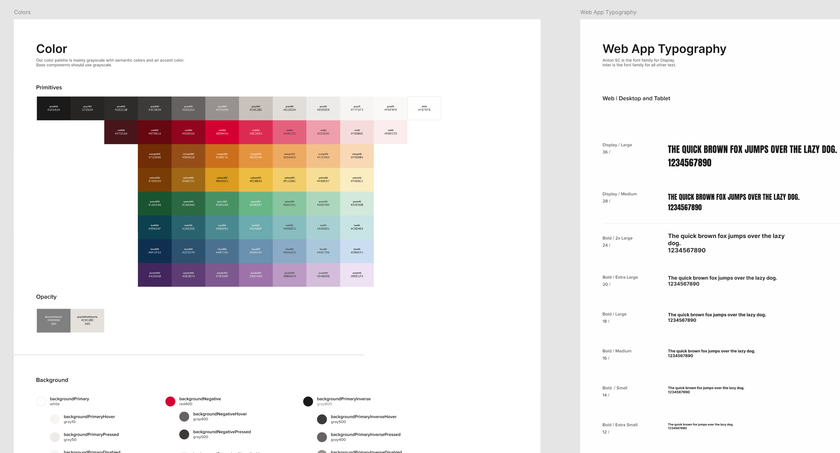
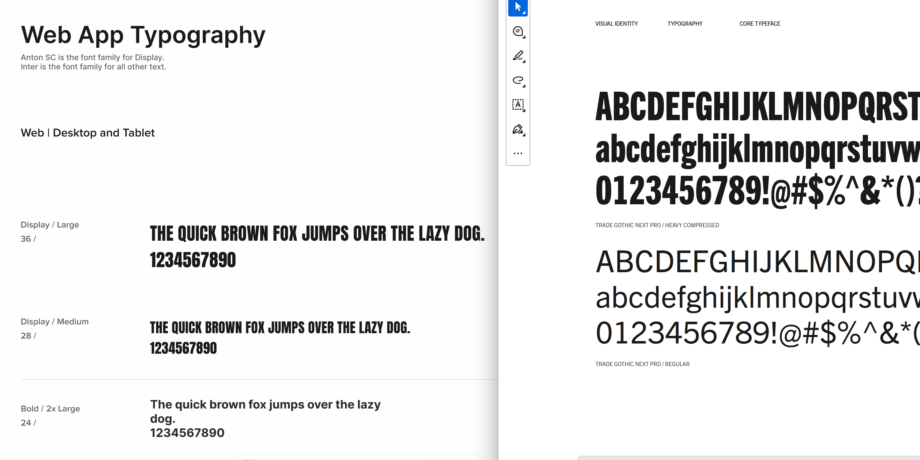
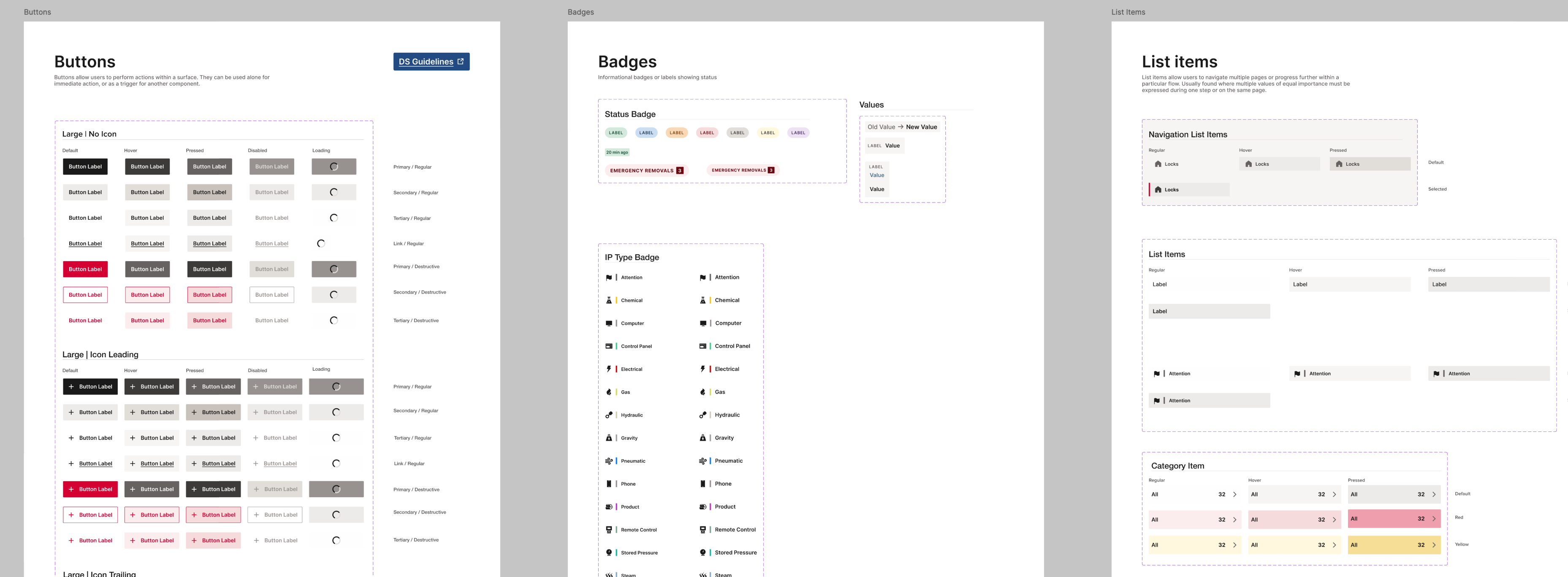
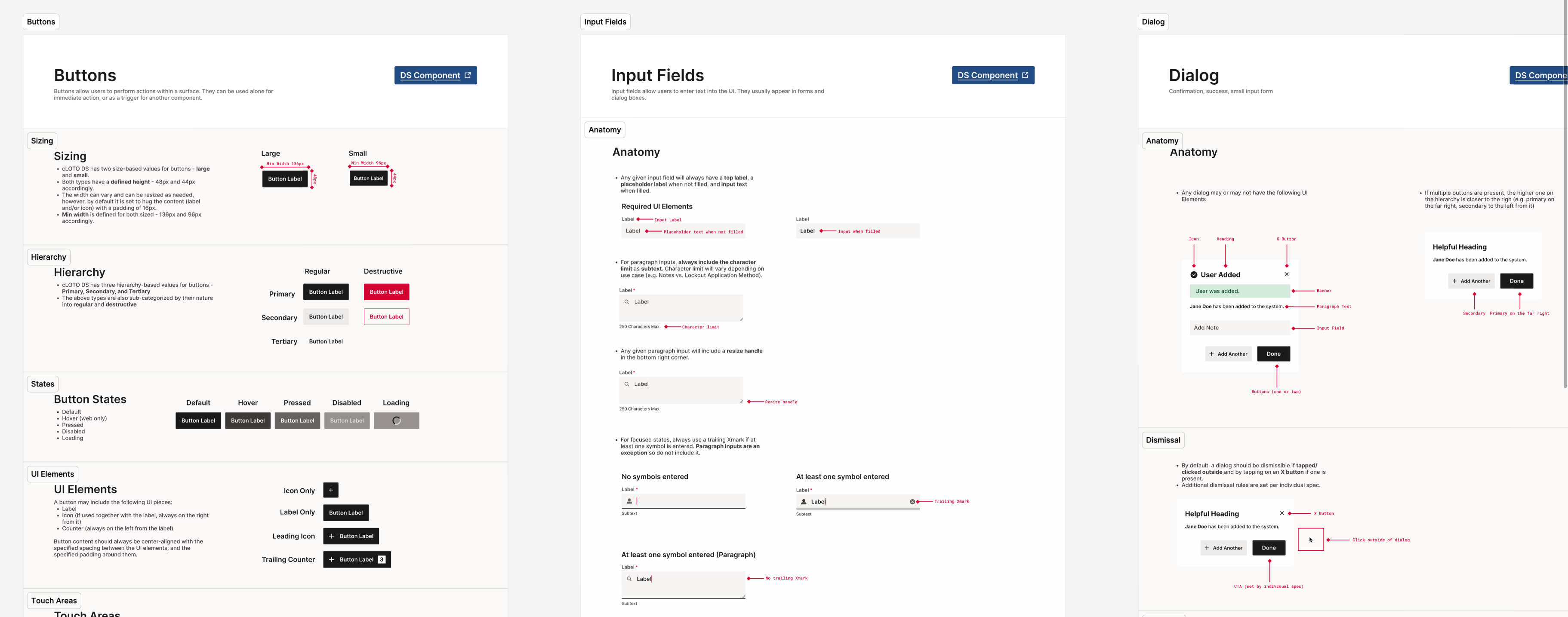
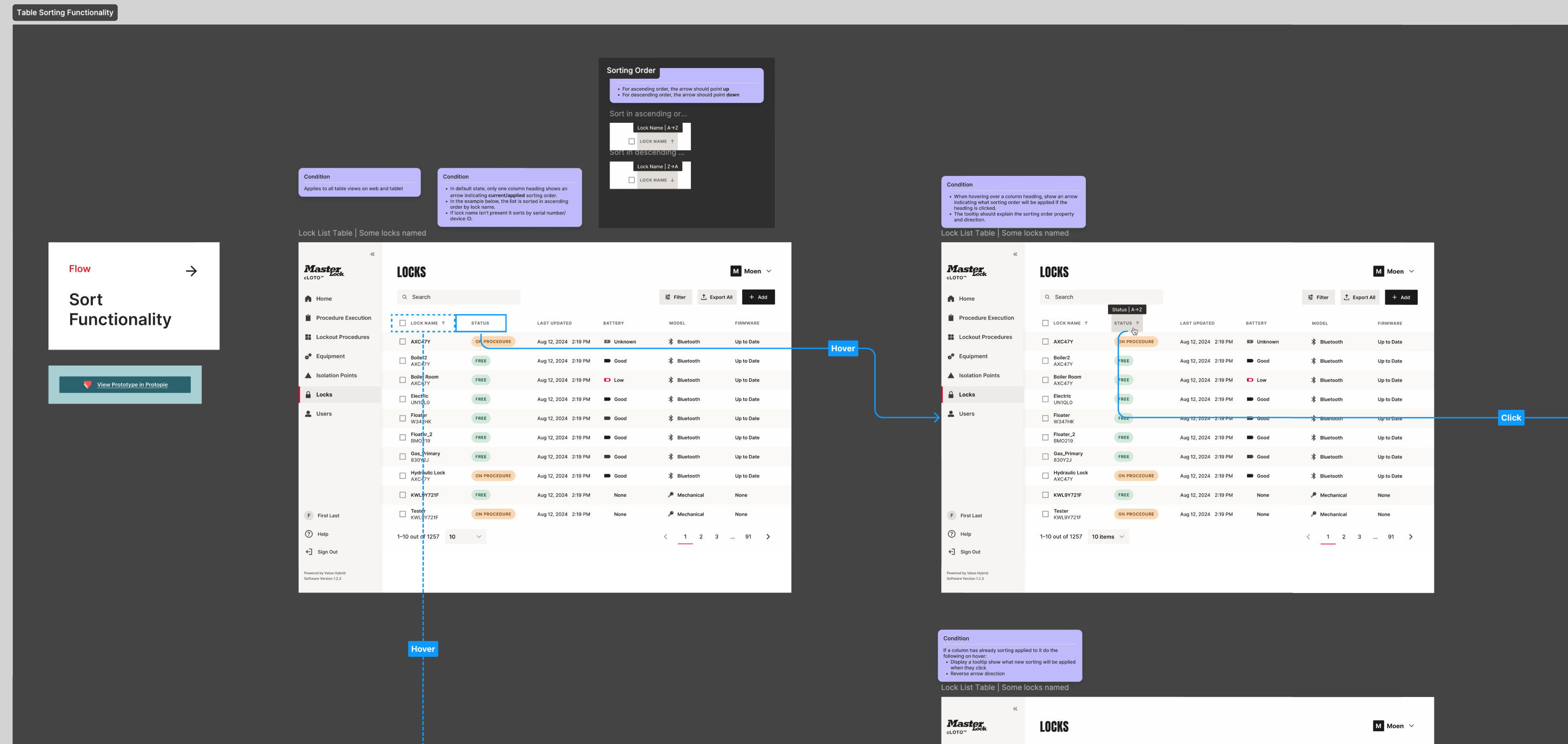
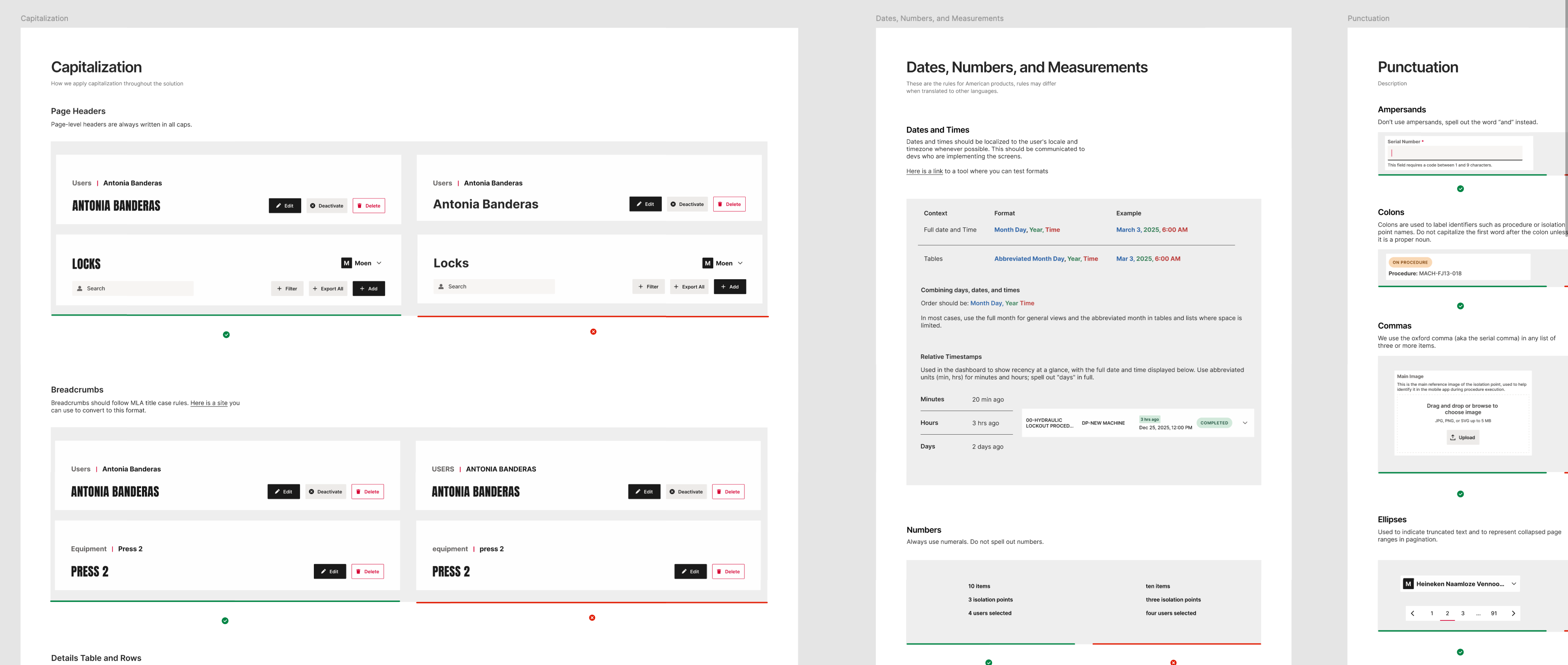
When Master Lock took over design responsibilities for cLOTO, the product had no design system, no shared language, and no scalable foundation. Every component was hard-coded, every decision undocumented. And the scope of what lay ahead was significant: a platform destined to expand across industrial facilities of every size and complexity — from small operations with tens of machines and users, to large enterprises managing hundreds of isolation points, thousands of users, and multi-layered hierarchies with varying lockout/tagout protocols. Without a robust design system, none of that growth would be possible.