Managing Users Wisely

User management for a safety-critical B2B platform with structure, visibility, and role clarity.

A user database that finally makes sense to people managing it

User management is often treated as a utilitarian feature — a table of names and roles that admins rarely think twice about. On the cLOTO platform, where every user has a defined role with specific permissions tied to life-safety procedures, getting it right mattered. This project covered the end-to-end redesign of user management: viewing and filtering the user list, adding, editing, deleting and deactivating users, and helping EHS managers — key users — understand who can do what, and why.

Starting with what already existed...

The original platform already had a user management functionality — but it was bare-bones: first name, last name, username, password, user role (with no explanation of what each role meant or what it allowed), and company. It was a starting point, not a solution.
User profile card for shift manager showing name, company unavailable, and edit and delete icons.

...refined through close collaboration with product...

The first step was working through a series of questions with the product team that might seem simple but had real implications for how the feature would behave. Many of these questions didn't have obvious answers. Rather than treating the existing platform as the source of truth, we challenged long-standing assumptions together and evaluated each decision based on how administrators actually managed people in safety-critical environments.

  • Should a user profile be editable while that user is actively executing a procedure? Yes.
  • Can a user be deactivated mid-procedure? Yes. Should a user be able to deactivate themselves? No, and the existing platform had that affordance, which we agreed to remove.
  • Should there be an avatar? Although avatars are common in user management systems, the data suggested they weren't providing meaningful value in this context. Removing them simplified the experience and allowed us to focus on information administrators actually relied on.
  • Should the list remain in card view? No — a table view better served the needs of administrators managing potentially large user databases.

...and every field made deliberate

With the structural decisions made, I worked through every data field from first principles — applying UX best practices to turn a rough list into a fully considered data model.

Many of these decisions seem small in isolation, but together they define how confidently administrators can complete a safety-critical task. I approached each field as an opportunity to remove uncertainty rather than simply collect information.

  • For names, I accounted for extremely long names and dual last names — common in Latin American and other markets.
  • For usernames, I designed a system that automatically generates a suggestion by combining first and last name, with a defined character limit.
  • For passwords, I researched and introduced requirements aligned with current security best practices.
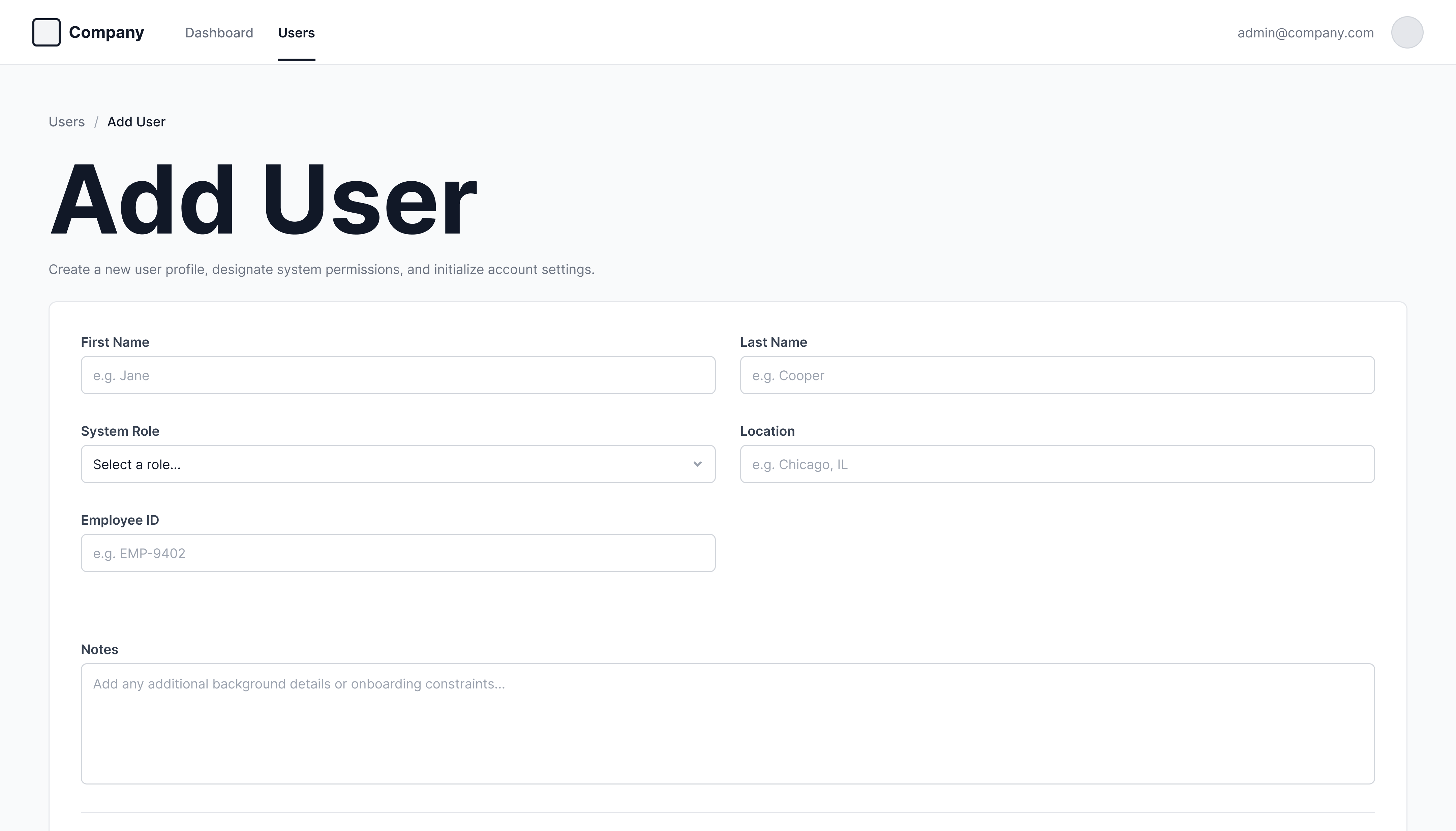
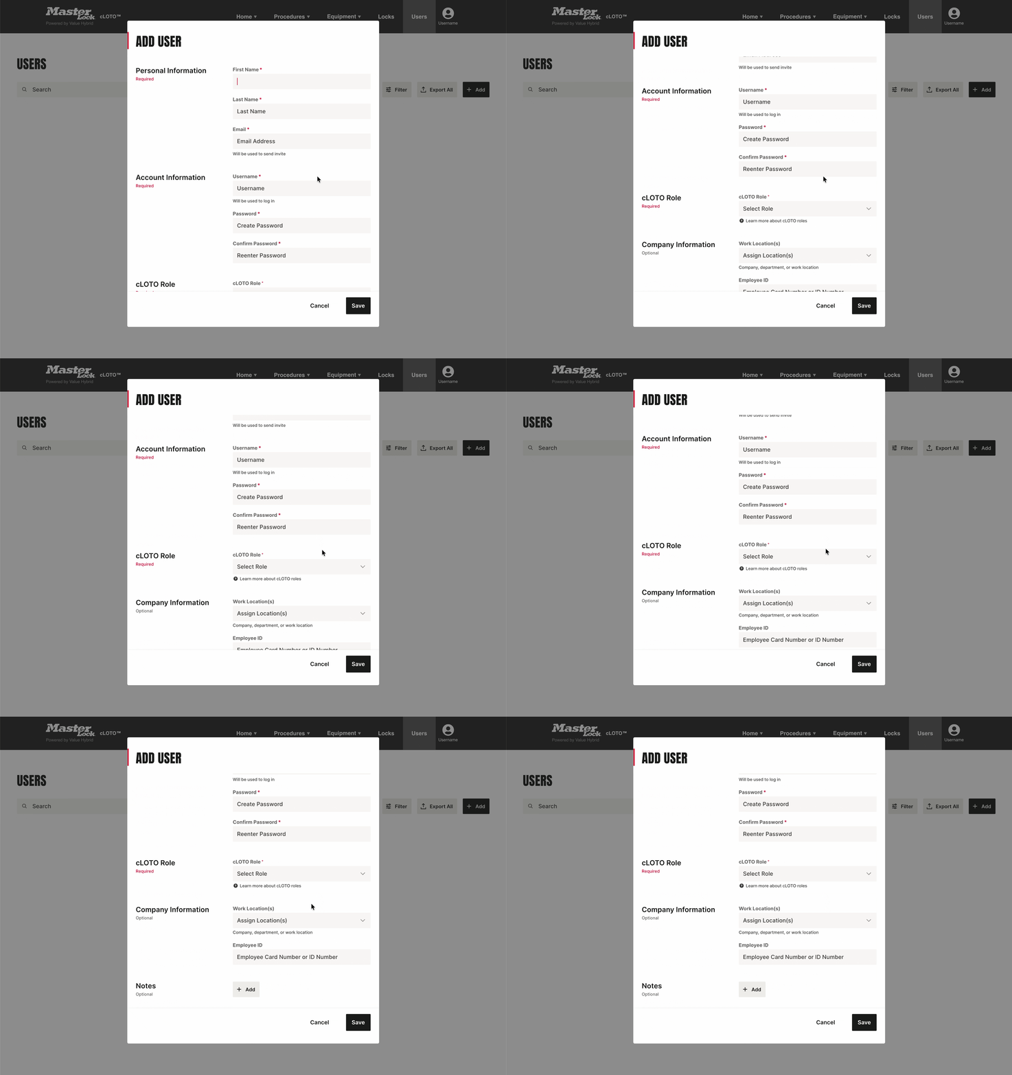
  • The add user form was structured into clearly separated required and optional sections to reduce cognitive load and guide admins through the process efficiently.
example:

Defining granular requirements and conditions for the username input field

A table view over cards,..

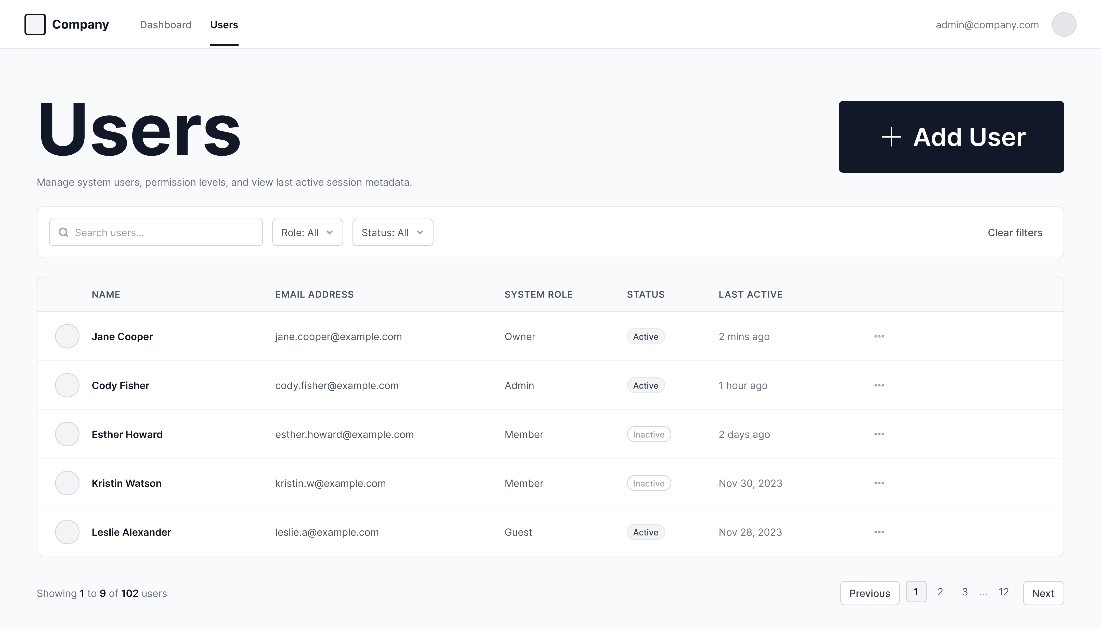
The original platform offered a card view for users. For user management, where administrators are working with potentially large lists and need to quickly scan, sort, and filter, a table view felt like the right call — and the only view needed. The table was designed to surface the most critical information at a glance: name, role, and key identifiers, with robust sorting and filtering to help admins navigate large user databases efficiently.

...a role system made legible for the first time,...

The cLOTO platform has six roles in a defined hierarchy - each with its own permission level:

  • Super Admin
  • Maintenance Manager Plus
  • Safety Manager
  • Maintenance Manager
  • LOTO Coordinator
  • Authorized Employee

Revising the role structure itself was out of scope, but it was obvious that platform users were in the dark about what their role actually meant. The roles were platform-specific rather than industry-standard, with no reference point for users to understand their own permissions.

I studied the full role permission matrix thoroughly and explored several ways of presenting role permissions, including more detailed tables, but they introduced unnecessary complexity. Through iteration and feedback, created a simplified visual reference that made the hierarchy and capabilities of each role immediately clear — linked contextually throughout the platform wherever cLOTO roles were mentioned.

before:

What the role matrix was

assumption:

With platform-specific cLOTO roles, users were in the dark about what their role actually meant, and didn't have a way to check that

Table showing user roles and permissions for IDP, Machines, Tasks, and Procedures systems in a grid format.
after:

What the role matrix became

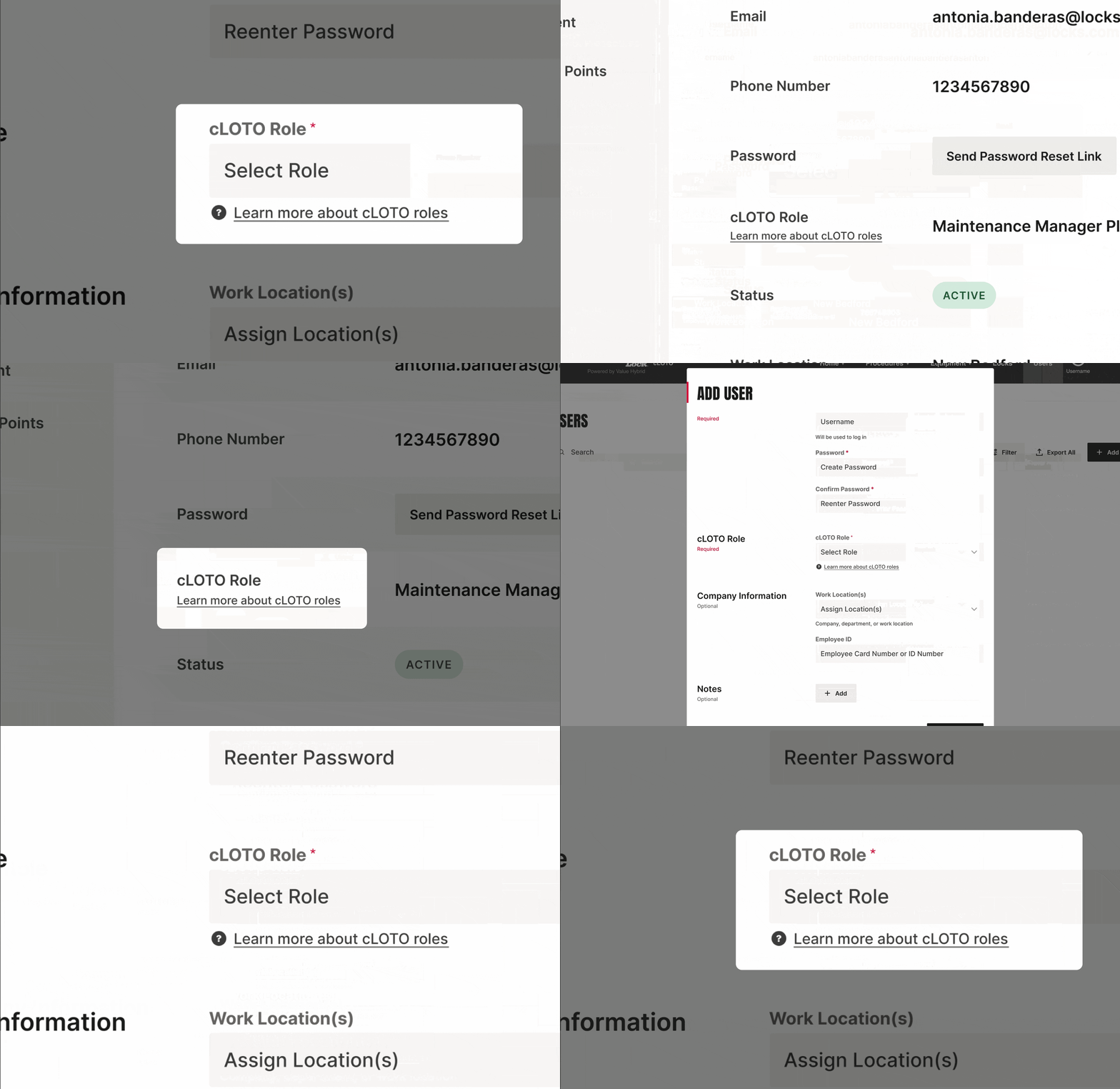
easily accessible:

The role matrix is now cross-referenced throughout the platform whenever user roles are mentioned

Scroll/swipe to explore
Right-pointing arrow icon
Form section with required dropdown to select cLOTO Role and optional dropdown for Work Location assignment.User info for Antonia Banderas with email, phone, Maintenance Manager Plus role, and active status.

...and a UI that helped define the design system itself

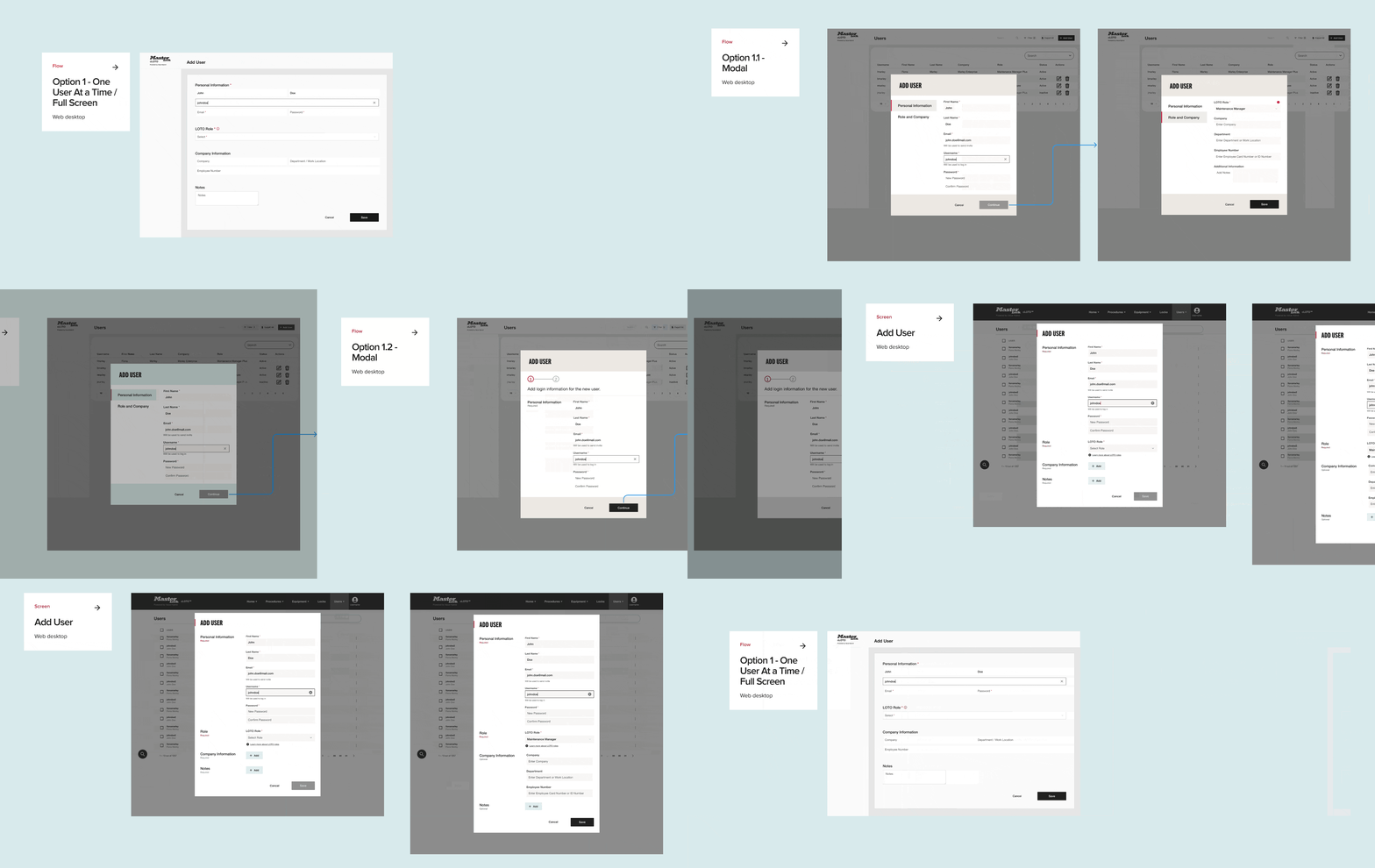
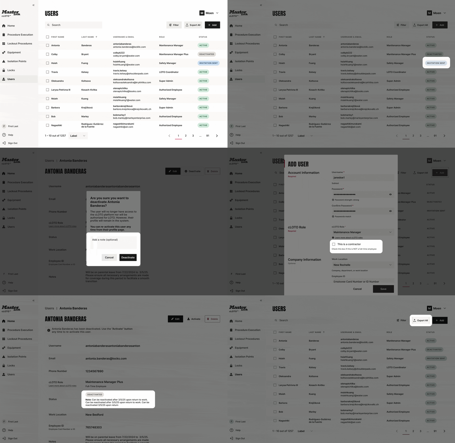
User management was the first flow to be built with the new design system — which was being developed in parallel. Working on the flow and design system simultaneously meant embracing ambiguity. Component decisions evolved alongside product requirements, and each iteration informed the other rather than following a fixed sequence. UI explorations done for user management became proving grounds for component decisions — color palette, styling of core UI, how tables should behave, how status badges should look and work, how forms should be structured. These explorations helped the team land on the overall visual direction for the design system that would carry forward across the entire platform.
dependencies:

Early UI explorations for the user management flows helped shape the design system

Validating our assumptions — and uncovering what was missing...

With a high-fidelity interactive prototype built in ProtoPie, I ran usability testing sessions with target users. Just as importantly, testing challenged some of my assumptions. Rather than treating validation as the goal, I used each session to uncover what we still hadn't considered:

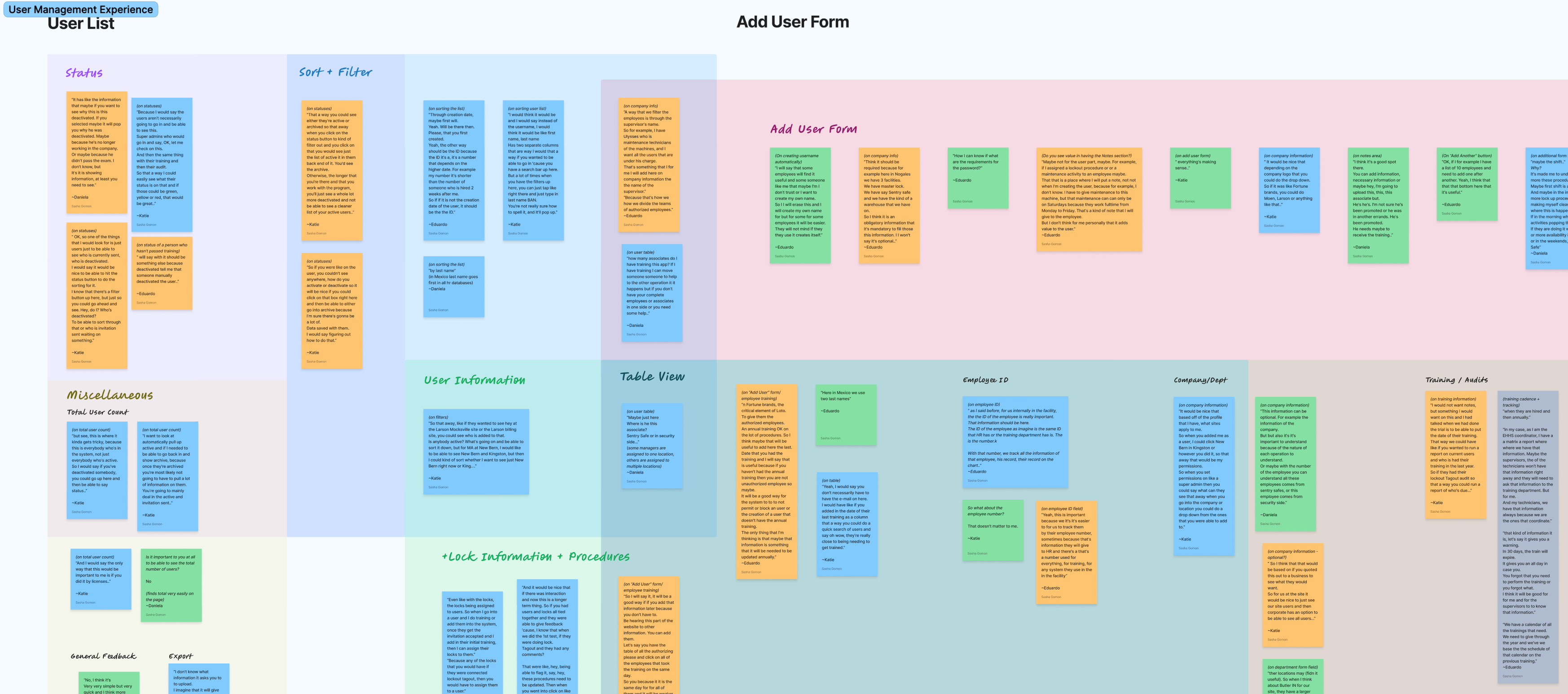
  • The table view immediately resonated with administrators, confirming that designing around their spreadsheet-based workflows was the right direction.
  • The simplified visual role matrix validated an early hypothesis: users needed a clear way to understand what each role allowed them to do.
  • The add user form, including the auto-generated username and clear separation of required and optional fields, was consistently described as intuitive by participants across different skill levels.
  • The "Add Another" action proved especially valuable for administrators creating multiple accounts at once, reinforcing the importance of supporting real-world workflows.
  • Testing also uncovered several unmet needs that hadn't surfaced during discovery. Participants requested a notes field for tracking special circumstances, along with additional administrative information and status indicators that became part of the next design iteration.
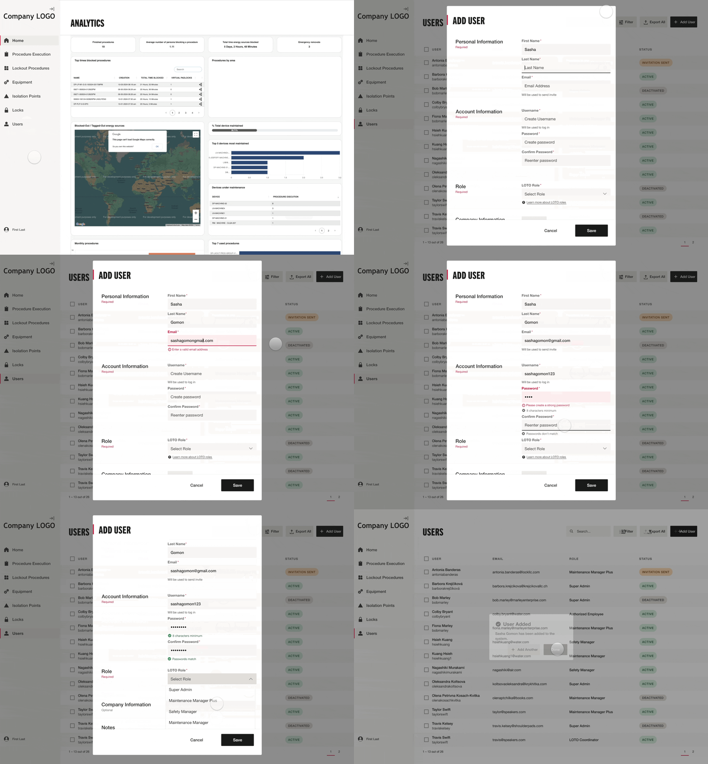
prototyping:

The high-fidelity prototype allowed for an "immersive experience" during usability testing

data synthesis:

Affinity mapping helped to see trends

...and what EHS managers truly needed to manage their workforce...

Several of the strongest improvements weren't ideas I brought into the project—they came directly from observing EHS leaders explain how they actually managed their teams. Those conversations reshaped the final experience far more than I expected.

  • Users needed company and department information for multi-facility operations, and an employee ID field for HR tracking and internal processes.
  • Export functionality was requested for teams relying on Excel-based user lists.
  • A new user status emerged — one for users who had been invited but hadn't yet accepted — requiring its own visual treatment.
  • Users also wanted color-coded status indicators for quick visual assessment.
  • When deactivating a user, the managers wanted to be able to add a deactivation note specifying the reason — whether parental leave, a compliance issue, or another circumstance — giving the team the context they needed when reviewing inactive accounts.
  • When adding a user's role, it became clear that teams needed to distinguish between full-time employees and contractors — which I accommodated by adding a "this is a contractor" checkbox after the role dropdown.
refinement example:

When deactivating a user, the EHS managers wanted to be able to add a note specifying the reason, which was accommodated in the design iteration

..with one significant exception

The most prominent unmet need was training and compliance tracking — users wanted to see statuses pertaining to compliance training and audit - who is due, whose training is expired etc. Training status, they explained, directly determines whether a user is authorized to execute lockout procedures. It was a legitimate and important request. However, our legal department determined that surfacing this information would introduce liability for MasterLock, and there was no time within the project timeline to develop the necessary legal protocols. The feature was scoped out, with the intention of revisiting it in a future phase.

While it was disappointing not to deliver functionality users clearly valued, protecting the company from legal risk was the responsible decision. The challenge became finding ways to acknowledge the need without introducing false confidence into the product.

descoped:

Statuses pertaining to compliance training - for legal reasons

User status table with labels for Active, Invitation Sent, Training Pending, Due, Expired, and Deactivated.

...brought to life through carefully crafted language

Across every screen, field, and interaction, I meticulously crafted the UX copy — status labels, form field names, placeholders, and supporting text — ensuring that every word was clear, consistent, and purposeful. In a platform where a misunderstood status or an ambiguous field label can lead to the wrong person being authorized for a safety-critical procedure, language isn't a finishing touch. It's a design decision.

I frequently iterated on terminology with product partners and stakeholders, testing whether labels reflected how users naturally described their work rather than how the system was originally built. To accelerate exploration, I used AI tools to rapidly generate and refine language alternatives before validating them with stakeholders. That allowed me to spend more time evaluating clarity instead of drafting copy from scratch.

End-to-end design ownership, from research to delivery

As a Senior Product Designer, I owned the full UX and interaction design process — spanning discovery, requirements definition, information architecture, high-fidelity prototyping, usability testing, and final design specifications — while also authoring all UX copy to ensure clarity and consistency across the interface.

Incorporating what testing taught us...

Usability testing validated the core design decisions and surfaced the unmet needs we've already covered — all of which were incorporated into the next iteration. Beyond the structural and functional additions, testing also confirmed that status visibility was a priority: administrators needed to understand not just whether a user was active or deactivated, but what each status meant in practice and at a glance. Color-coded indicators and carefully crafted status labels were refined to ensure that meaning was immediately clear without requiring interpretation.

...and delivering specs that left nothing to interpretation...

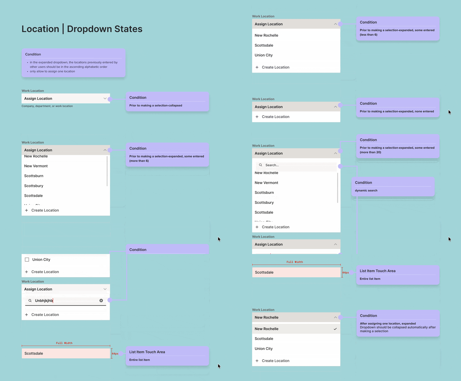
The final design specifications were delivered across three breakpoints — web, tablet, and mobile — documenting every screen, state, condition, and interaction. Errors, loading states, empty states, edge cases, and conditional logic were all accounted for and annotated, leaving no room for developers or QA to second-guess intent.
Throughout implementation I viewed engineering as design partners rather than recipients of specifications. The documentation was intended not just to answer questions, but to prevent ambiguity before it appeared.
handoff example:

Location dropdown conditions & labels for when it's expanded, collapsed, has or doesn't have a search bar, scroll behavior, empty state, error handling etc.

...including patterns that scaled beyond this flow

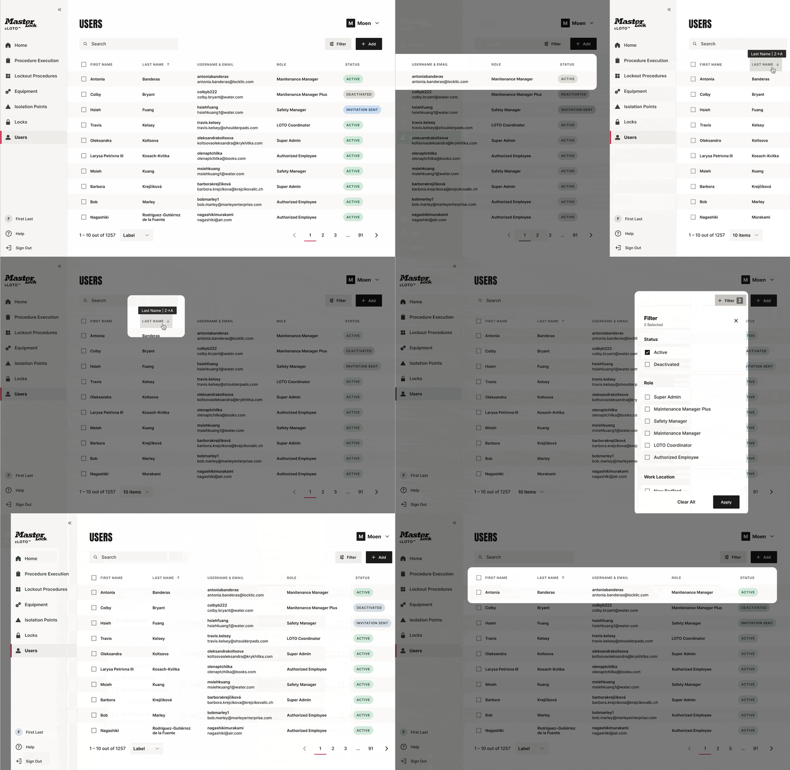
The sorting and filtering behaviors designed for the user list were documented as cross-platform guidelines — establishing reusable patterns for how sorting and filtering should work consistently across the entire cLOTO platform. Like the image functionality guidelines that emerged from isolation point management, these became part of the design system documentation, ensuring that decisions made once were applied consistently everywhere.
documentation:

Sorting and filtering behavior established was documented and applied as a cross-platform pattern for other areas

From a bare-bones form to a thoughtful, field-ready experience

The redesigned user management experience gave the EHS mangers the clarity and control they needed to manage their workforce confidently. Users could now see not just who was in the system, but what role they held, what that role allowed them to do, and what their current status meant in practice. The qualitative feedback from usability testing reflected a meaningful improvement in user satisfaction. EHS managers now felt informed and in control rather than confused and uncertain. One of the most rewarding outcomes wasn't introducing new functionality — it was seeing the key users gain confidence in decisions that previously felt uncertain. Simplifying complexity ultimately mattered more than adding features. Beyond the flow itself, the UI explorations done as part of this project helped establish the visual foundation that the rest of the cLOTO platform was built upon.
EHS manager:

“I think what I have seen is very simple in a good way - it takes you where you need it to. It's very easy.”

  • Led end-to-end UX design and research for the user management experience
  • Collaborated with the product team to define and refine requirements, resolving edge cases and removing redundant functionality
  • Worked through every data field from first principles, applying UX best practices to build a fully considered data model
  • Created a high-fidelity interactive prototype in ProtoPie to validate requirements and surface unmet user needs
  • Designed a table-based user list with robust sorting, filtering, and clear status visibility
  • Created a simplified visual role matrix and integrated it contextually across the platform
  • Accommodated all user-requested additions surfaced in testing, navigating a legal constraint around training and audit data responsibly
  • Authored all UX copy — status labels, field names, placeholders, and supporting text — ensuring clarity and consistency throughout
  • Delivered handoff-ready specifications across three breakpoints, documenting every screen, state, condition, and interaction
  • Documented sorting and filtering patterns as reusable cross-platform guidelines in the design system

Designing a path forward for the training and audit feature

The decision to exclude training and audit information was driven by a legal constraint we didn't anticipate early enough in the process. This project reinforced an important lesson for me: legal, compliance, and operational constraints shape product decisions just as much as user needs. Bringing those partners into conversations earlier would have helped us identify tradeoffs sooner and explore alternative paths before expectations had been set.

As an option, in hindsight, I would have pushed to design a placeholder or forward-looking message within the UI — acknowledging that this capability was on the roadmap and setting expectations accordingly. Users who surfaced this need in testing had a legitimate and important use case, and leaving it completely unaddressed in the interface missed an opportunity to build trust and signal that their feedback had been heard.