Installation Experience

Redesigning the end-to-end installation experience for the Assure 2 lock family, spanning in-app flows, printed manuals, and out-of-box experience.

Yale Assure Lock 2 Plus key-free lock with keypad and instructions to use Yale Access App for setup and operation.Screen showing install guide page about using Door Checker page to take door measurements.

When bad instructions make good hardware feel cheap

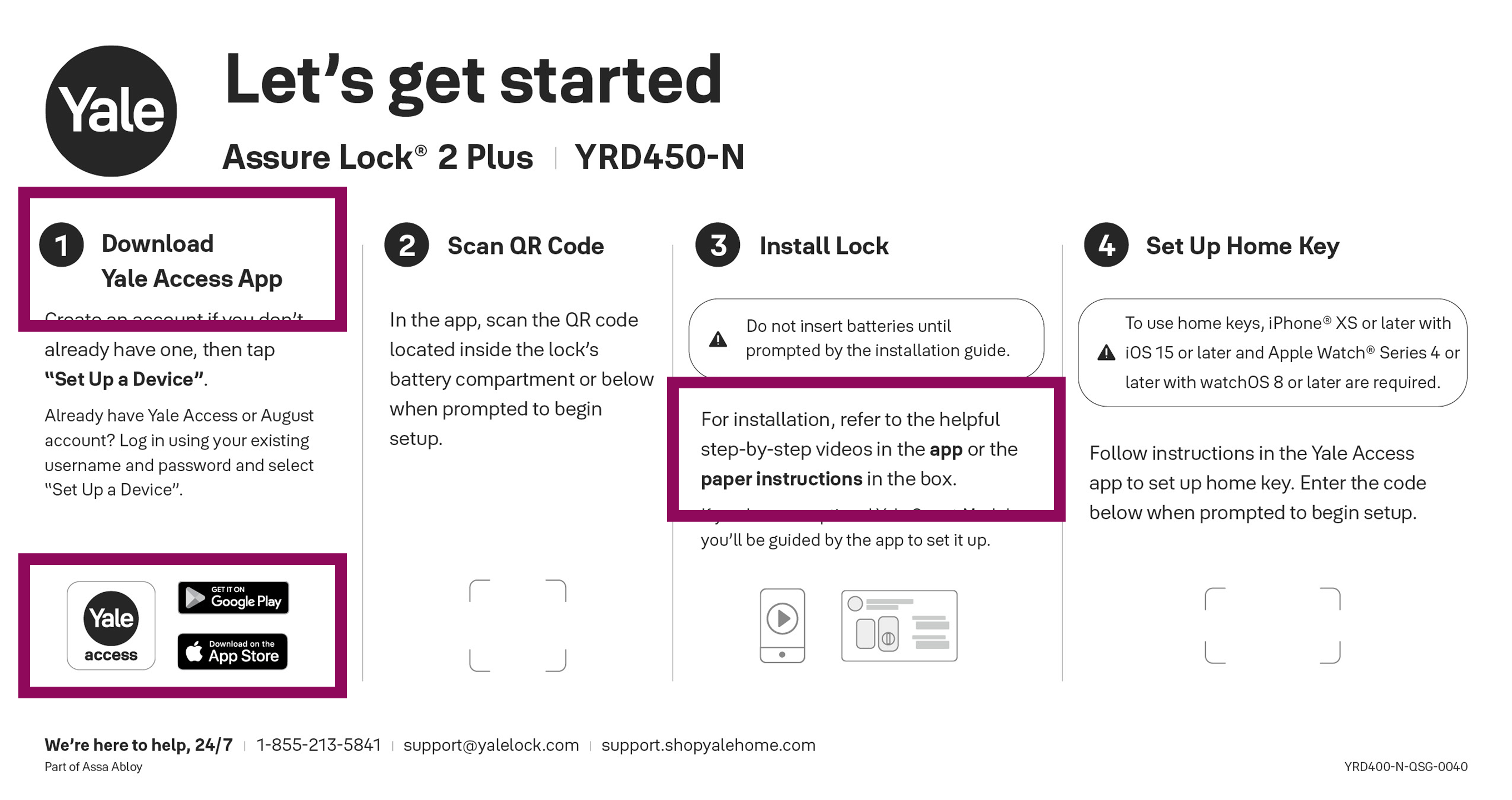
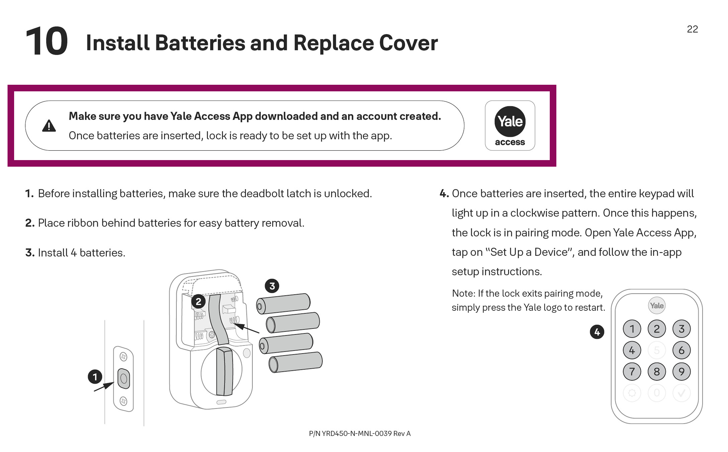
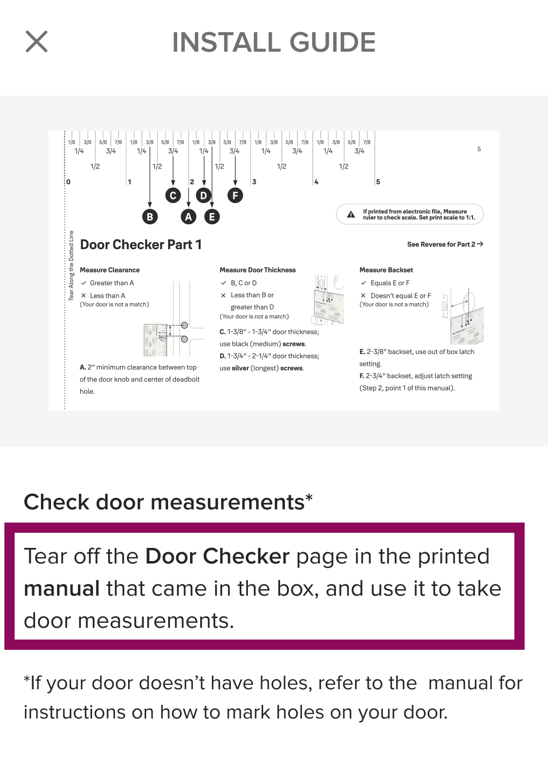
The Yale Assure 2 keypad lock family is a technically impressive product — but up to a certain point, its installation experience wasn't living up to it. The printed manual, quick start guide (QSG), and in-app installation instructions each told a different story: inconsistent language, mismatched steps, unclear illustrations, and no meaningful cross-referencing between them. For a non-technical user opening a box and trying to install a smart lock, the experience was frustrating at best — and return-inducing at worst. I took ownership of this end-to-end, redesigning the entire installation ecosystem from the ground up.

Three touchpoints, three versions of the truth...

A heuristic evaluation of the existing printed manual, QSG, and in-app installation guide revealed a fragmented experience throughout. The manual was dense and poorly structured — pages crammed with information, no clear visual hierarchy, and illustrations so technically complex they were more confusing than helpful. Terminology was inconsistent and often misaligned with how users naturally think about their door hardware: "cross bore" versus "edge bore," "mounting bracket" versus "mounting plate," "adapter" versus "bore hole cup." The QSG made no reference to the app. The app made no reference to the manual. Users were left to piece it all together on their own.
Instruction to measure strike pocket diameter and depth on a door for Yale smart lock compatibility.Instruction sheet for installing keypad and mounting plate with bolt length guide and wiring diagram.
Schematic diagram of an electronic device circuit board with various components and connectors.

...confirmed by what users were saying

Beta user feedback told a consistent story, and affinity mapping surfaced a few clear pain point clusters.

  • The quick start guide was causing active confusion — wrong QR codes led users to incorrect installation videos, and users couldn't distinguish between the QSG and the manual when one referenced the other.
  • Critical components were missing from the documentation entirely: DoorSense - door position sensor - wasn't explained or listed in the parts breakdown, the smart module and WiFi capabilities were poorly documented, and the multiple QR codes and serial numbers on the device had no clear descriptions.
  • Installation itself had several friction points — the ruler tool for screw selection was confusing and sometimes inaccurate, the pre-attached mounting plate led users to think parts were missing, and cable routing and backplate orientation instructions were unclear.
  • Finally, the app integration was an afterthought: nothing guided users to download the app before starting installation, causing Bluetooth pairing timeouts, and users who successfully completed the physical install were left with no clear path to actually setting up their lock's functionality. The app's own videos were consistently more helpful than the printed materials — but they weren't prominently referenced anywhere.
approach:

Affinity mapping helped surface clear pain point clusters

End-to-end ownership of the full installation ecosystem

I led this project independently from start to finish — conducting the heuristic evaluation, synthesizing beta feedback, defining the user flow, establishing illustration guidelines, creating 60+ hand-drawn illustrations per manual, standardizing language across all three touchpoints, prototyping and testing, and ultimately delivering print-ready manual specifications and updated in-app installation content. I also established and documented guidelines for printed manuals that could be applied to future Yale products.

Mapping every path a user might take...

One of the most important early decisions was recognizing that users don't all take the same path. What's their door hardware like? Do they have an existing deadbolt to remove? Do they need to drill holes themselves? Do they want to install DoorSense? Did their lock come with a smart module? I mapped out the full user flow to account for all possible paths — including conditional branching, optional steps, and cross-references to the physical door checker and marking template included in the manual.
Scroll/swipe to see more
Dark purple arrow pointing straight down.
User flowchart showing steps from start setup, app use, tools needed, event handling, to user login and document install.

...translated into a wireframe where manual and app cross-reference each other...

With the flow defined, I wireframed the manual page by page — roughing out the structure, content hierarchy, and moments where the manual would direct users to the app and vice versa.

Scroll/swipe to see more
Dark purple arrow pointing straight down.
Detailed wireframe layout showing design notes, installation guide, and app UI screens for a smart lock product.

...with no room for ambiguity on paper

A printed manual has no buttons, no interactive prompts, and no error recovery — conditions and branching logic have to be communicated entirely through words and visuals. Every conditional had to be expressed with enough clarity that a user could follow it without hesitation — because in an installation context, ambiguity doesn't just frustrate users, it can lead them to damage their door.

constraint:

Branching logic on paper only relies on language and visuals

Three-step door installation guide with steps to remove deadbolt, check measurements, and make holes.

Making technical things perceivable by an average human eye...

The original manual relied on dense CAD-style technical drawings that were overwhelming and difficult to interpret for non-technical users. The goal was to replace them with simplified, purposeful illustrations that highlighted only what mattered for each specific step. I began by studying different illustration styles — from highly detailed renderings to minimal line drawings — evaluating each for clarity, scalability across multiple SKUs, and feasibility for in-house production. The winning approach: simplified drawings built from basic shapes, with a clear and consistent visual language.
Diagram plus photo showing how to connect a cable to a circuit board inside a device casing.

...guided by a rigorous illustration system

To ensure consistency across 60+ illustrations per manual, I established a comprehensive illustration style guide covering: stroke weight (accent at .5px, secondary at .25px), color swatches (two accent and two secondary values for depth and highlights), arrow style (a single standardized preset), and text treatment (fill-only, never outlined, with specified values for primary and secondary text). I worked directly from CAD drawings and physical product photos to create simplified vector references of the lock and door hardware — highlighting only the specific detail relevant to each installation step.
Scroll/swipe to see more
Dark purple arrow pointing straight down.
Illustration guidelines showing styles, CAD use, color, stroke weight, and style for product manual images.

One product, one voice, one set of terms

A significant part of the work was establishing a consistent language system across all three touchpoints. This meant making deliberate decisions about hardware terminology and sticking to them everywhere. "Edge bore" rather than "cross bore" — because the hole is on the edge of the door, making the association more intuitive. "Mounting plate" not "mounting bracket." "Adapter" not "bore hole cup." "Deadbolt latch" as the consistent name for that component. "Security screws" rather than generic fastener references. Every term was chosen for clarity and consistency, then applied uniformly across the manual, QSG, and app — so that a user who read the manual and then opened the app would encounter the exact same vocabulary.

Print it, read it, fix it — repeat

A critical part of the process was physical prototyping. I printed the manual at multiple stages — more than 5 rounds — to evaluate how swatches, typography, and illustrations actually looked and felt on paper, rather than on screen. This revealed issues that wouldn't have been caught digitally: text too small at print scale, illustrations that lost detail, spacing that felt cramped. Each round was reviewed with cross-functional partners — hardware and marketing teams — for accuracy and brand alignment, with language reviewed for clarity and correctness throughout.
Printed manual pages showing steps to check door measurements and make or adjust holes with diagrams and instructions.

A holistic installation ecosystem where everything works together...

The final deliverable was a fully redesigned installation experience across all three touchpoints — cohesive, consistent, and built for a non-technical user. The printed manual features a clear structure with 35+ page templates, simplified illustrations, intentional white space separating text from visuals, and consistent hardware terminology throughout. The QSG references the app and the manual at the right moments. The app references the physical materials where relevant. All three speak the same language, share the same visual style, and guide the user through the same journey — each complementing the others rather than contradicting them.

The result: a 75% increase in NPS across the Yale keypad lock family.
quick start guide:

Referencing app and manual

Yale Assure Lock quick start guide showing steps: download app, scan QR code, install lock, set up home key.
manual:

Referencing app

A sample page from the printed manual referencing the app
app:

Referencing manual

Install guide showing Door Checker Part 1 with measurements for clearance, door thickness, and backset.

...and a foundation for every installation experience that follows

I documented all of the best practices established through this initiative — covering layout and spacing, typography, color, illustrations, iconography, and language — personally onboarded teammates on the guidelines, and provided ongoing support as they applied them to improve installation experiences for other Yale products.

The result: a scalable foundation that the team could build on independently.
  • Led the full redesign of the installation experience across printed manual, QSG, and in-app guide
  • Conducted heuristic evaluation and affinity-mapped beta user feedback to define improvement areas
  • Mapped complete user flow accounting for all installation paths, conditions, and optional steps
  • Established illustration style guidelines and created 60+ hand-drawn vector illustrations per manual
  • Standardized hardware terminology across all three touchpoints for consistency and clarity
  • Prototyped and iterated through 5+ rounds of physical print testing with cross-functional review
  • Delivered 35+ print-ready page templates with scalable layouts for future SKUs
  • Established and documented printed manual guidelines for typography, layout, color, illustrations, iconography, and language
  • Drove a 75% NPS improvement across the Yale keypad lock family